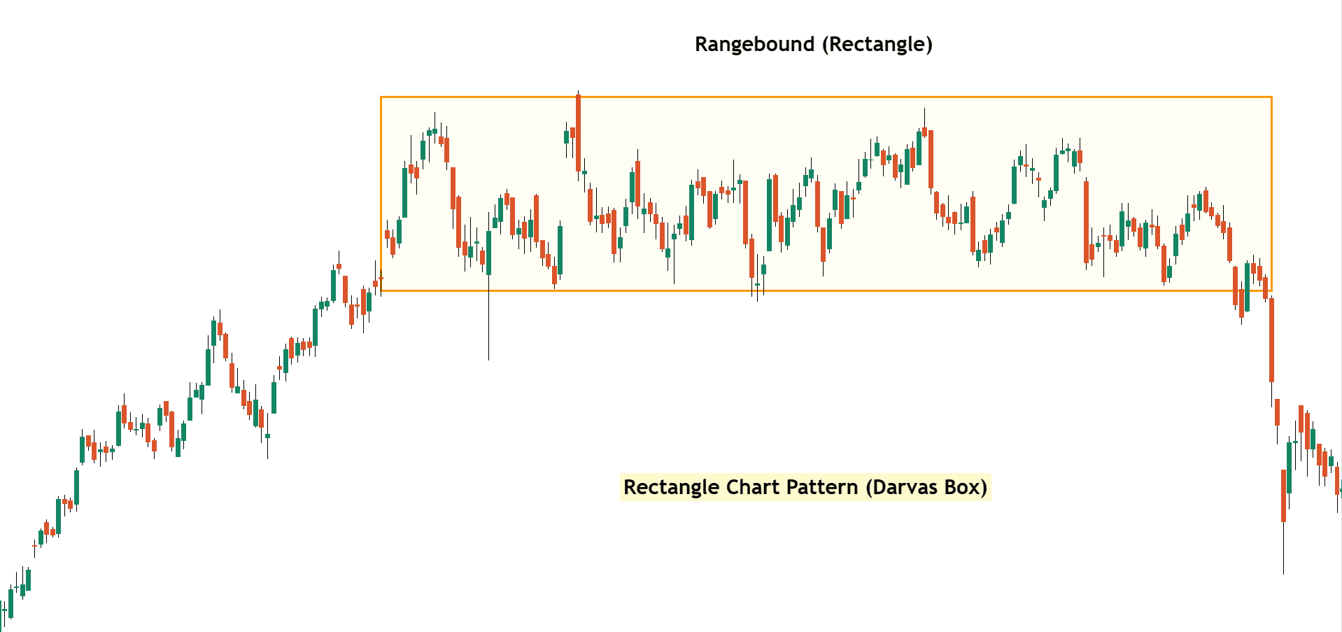
Summary: The Rectangle Chart Pattern, also called the Darvas Box, is a simple chart pattern where the price moves between two straight lines like a sideways or consolidation — one at the top (resistance) and one at the bottom (support). It shows that the market is taking a break. A breakout from this range can signal a good buying or selling opportunity.
In this blog post, we’ll learn about the Rectangle Chart Pattern (Darvas Box), how to identify it, trading strategies, examples, and essential tips to consider while trading with it. So, let’s discuss…
What is a Rectangle (Darvas Box) Chart Pattern?

The Rectangle Chart Pattern, also known as the Darvas Box, is a popular price action pattern that helps traders identify consolidation zones and breakout opportunities.
The Rectangle Chart pattern forms when the price moves within a defined horizontal range, creating a box-like shape on the chart. The upper boundary acts as resistance, and the lower boundary acts as support. This pattern represents a period of consolidation, where buyers and sellers are in equilibrium.
When the price breaks out of the box, it signals a strong move in the direction of the breakout.
“The Darvas Box, developed by Nicolas Darvas in the 1950s, is a variation of the rectangle pattern. It involves drawing boxes around price ranges based on previous highs and lows. Darvas used this method to identify potential breakouts and trend-following opportunities, especially in trending stocks.“
How to Identify the Rectangle (Darvas Box) Pattern
To identify a Rectangle Pattern or Darvas Box:
- Look for at least two touches at the top (resistance) and bottom (support).
- The price should move sideways within a horizontal channel.
- A strong breakout confirms the pattern’s end and shows the signal where the breakout happens.
Formation of Rectangle (Darvas Box) Pattern
Example 1: Rectangle Pattern Formation Analysis

Sideways Movement (Consolidation Phase)
The price goes up and down between two levels, the top line (resistance) and the bottom line (support). This creates a box-like shape on the chart. It means the market is taking a break, and no strong trend is happening.
Breakout (Breakout Phase)
After a long time, the price breaks out of the box, it can go above the top line (a sign to buy) or below the bottom line (a sign to sell). This breakout leads to a strong move in that direction.
How to Trade the Rectangle (Darvas Box) Pattern
Once you’ve spotted this rectangle pattern, prepare for the perfect trading entry!
Entery
Bullish Breakout: Enter a long trade when the price closes above resistance.
Bearish Breakdown: Enter a short trade when the price breaks below support.
Stop Loss
Bullish: Place a stop-loss slightly below the support zone.
Bearish: Place a stop-loss slightly above the resistance zone.
Note: If the price moves in your direction, trail your stop loss using this technical indicator (eg, 20 Moving Average) to protect your gains.
Exit
Measure the height of the rectangle and add that same distance above the point where the breakout happens. This gives you a rough idea of where the price might go next.
Pros & Cons of Rectangle (Darvas Box) Pattern
Pros
- Easy to identify on the chart
- Works in both bullish and bearish market
Cons
- False breakouts are common
Common Mistakes to Avoid
- Entering before confirmation
- Ignoring trend direction
- Not using stop losses
- Overtrading during sideways movement
Here’s what I’m curious about…..
Have you traded rectangle or darvas box patterns before? What is your favorite chart pattern aside from this?
Let me know in the comments below and share your thoughts!…..

